#beautiful nature wallpaper big size
Explore tagged Tumblr posts
Text
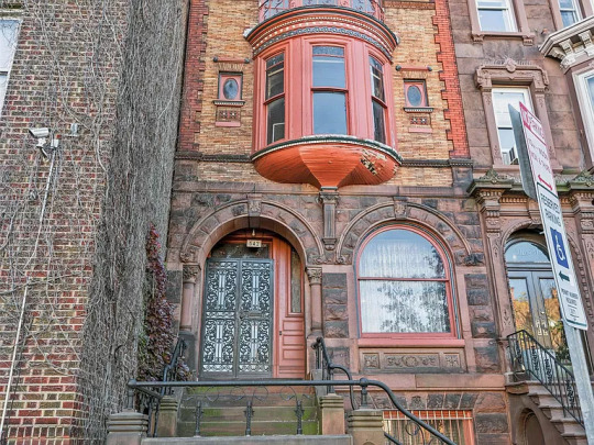
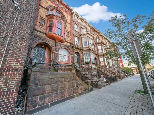
Beautiful 1881 Victorian Renaissance Revival is located on a block of brownstones in Jersey City, New Jersey. I looked it up, and it's safe during the day, but the area has a 26% higher crime rate than the rest of the city. The house has 5bds, 2ba, & is priced at $1.29M. (Zillow feels that it's worth $726.3K)

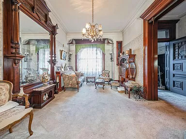
The house has magnificent original features, but it's a little worn.
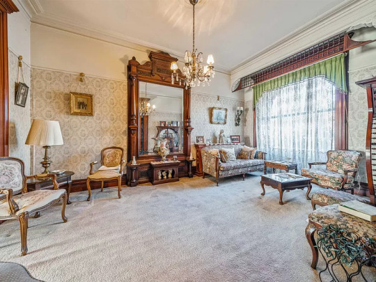
Look at the magnificent mirror in the sitting room. I wonder what's under the carpet.
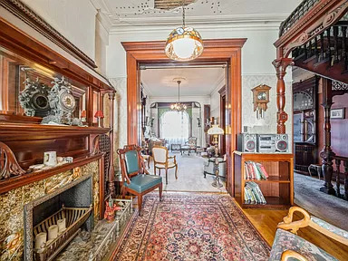
There's a glimpse of fallen plaster on the ceiling in this room, and a water stain on the left that goes from ceiling to floor.
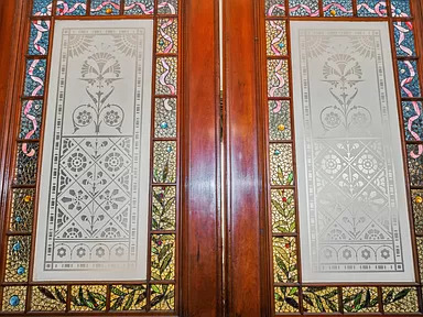
These double doors open to the dining room.

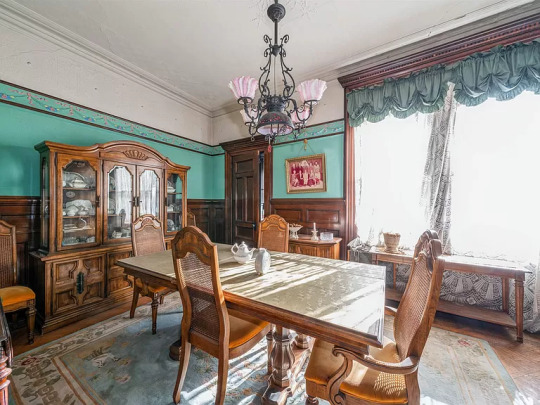
The dining room is a large size.
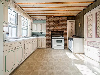
The kitchen is not good. It was last renovated in the 60s and is very dated. For a home priced over $1M, it doesn't even offer a dishwasher. The stove fits partly into the original fireplace, but it looks like they refaced it with 60s faux brick.
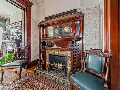
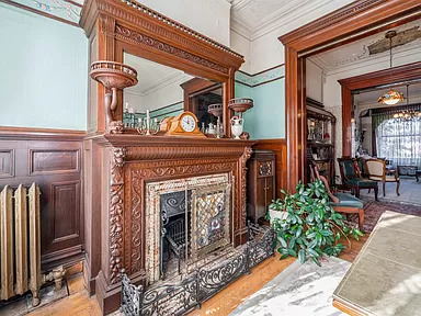
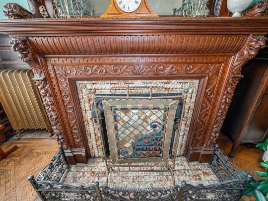
The fireplaces are stunning. Some even have iron frames around the marble hearths, beautiful tile, and stained glass fire screens.
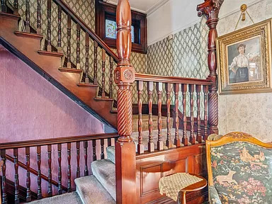

The millwork on the stairs is gorgeous. There's a stained glass window, too. The wallpaper looks like it needs to be replaced, which would be a big expensive undertaking.
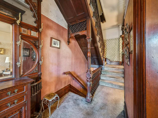
The carpet on the stairs needs to be removed.

On the upper floor is a sitting room and bedrooms.

This bedroom gets a lot of natural light, has a big beautiful fireplace, and an alcove.
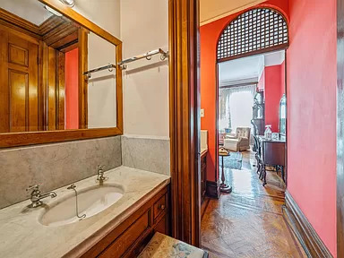
One of the 2 baths is up here.

And, this is another lovely fireplace in a bedroom.
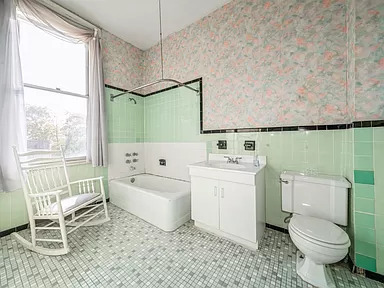
The 2nd of 2 baths is kind of retro, so it must've been redone around the 40s or 50s.
144 notes
·
View notes
Text
PINKPANTHERESS FT. ICE SPICE - BOY'S A LIAR PT. 2
youtube
That's a wrap on Day 1! And we're just getting started...
[7.09]
Jacob Sujin Kuppermann: The last time we talked about PinkPantheress I called her music "aural wallpaper" -- and I stand by that! It's just that "Boy's a liar" is exquisite aural wallpaper, the kind of endlessly loopable pop hit that has just enough variation to sound fresh even after most of a year's worth of overplay. Part of that comes from her guests. Ice Spice's verse is the most genuinely affecting she's ever been, and Mura Masa's assist on production varies the UK Garage-nostalgia formula just enough for it to work, bringing in faux-8-bit synth lines to cut through PinkPantheress' still-simple melodies. Yet the PinkPantheress of "Boy's a liar" is herself an artist evolved, one more driven towards actual sing-along hooks rather than just moods to ruminate in. The change works -- that chorus will be embedded in my head for the rest of my life, which I have to assume was the goal. [9]
Joshua Minsoo Kim: PinkPantheress riffs on UK dance music in a way that's antithetical to why I was drawn to it -- her diaristic lyrics and hushed vocalizing subtly position the music as a singer-songwriter's work, steering any breakbeat or 2-step jitter away from maximalist dancefloor pleasures. Her latest album Heaven knows assuaged some of my skepticism: "True romance" is tasteful in its momentary adoption of jungle, "Feel complete" brings her work in conversation with turn-of-the-millennium Shibuya-kei, and "Ophelia" is a hefty conceptual gambit that could only work with a sound so diaphanous. Before all this, though, was "Boy's a liar Pt. 2." It was the first track that made me appreciate the sketch-like nature of her craft. The song hinges on Ice Spice's nimble maneuvering of the beat, whose harpsichord-like melody and chiptune blips place this sorrowful recounting of a shitty ex as a truly timeless phenomenon. Ice Spice arrives mid-confession to act as the supportive friend -- if it's not completely felt in the lyrics, then it's there in her playful yet acerbic tone. She provides necessary relief; PinkPantheress' "good enough" chants feel slightly more hopeful by the time the song ends, like she knows she'll come out the other end soon. [6]
Jonathan Bradley: Ice Spice lays down 16 frothy bars that feel like eight, yet everything about this track feels twice as insubstantial as it really is. PinkPantheress contributes a burble-chirrup that in pixelated patterns of toy piano and ringtone synth and a back-and-forth loop that sounds most like a digital fish blowing bubbles. Suitably, Ice Spice's vocabulary abstracts into a "duh-duh-duh" that she still manages to rhyme with "shouldn't have." [8]
Oliver Maier: Big year for these two. The "good enough/duhduhduh/should'nt've" three-piece is amazingly silly, the axis around which the song (and most of the memes it has produced) spins and a great distillation of what is appealing about Ice Spice as a rapper. Not much else jumps out, though. PinkPantheress has a good ear for feathery beats, but this one feels paper-thin, and the chiptune flourishes get grating quick. [4]
Wayne Weizhen Zhang: In which the value propositions of two emerging stars are perfectly merged. Effortlessly flexing and trashtalking, Ice Spice plays the foil to the cutesy but wounded and contemplative PinkPantheress. This is what shit talking a boy with a friend should sound like. [8]
Katherine St Asaph: Mura Masa called this single "borderline misandrist"; if so, that border is the size of a moat. The song isn't about boys as a group but one particular boy, whose crime isn't being a liar necessarily but being hypercritical. And "Boy's a Liar" isn't a breakup song so much as an epiphany: a celebration of the first tentative tendrils of renewed self-confidence. "You only want to hold me when I'm looking good enough" should not feel quietly radical, but after hearing "actually, beauty standards are primarily enforced by other women!" horseshit for seemingly decades, it does. Maybe that's why this diaphanous little single has gravitas beyond its weight. Or maybe it's just because I'm job hunting right now, and "Boy's a Liar" has been a great soundtrack for my (at time of writing) 194 autorejections. (damn) [9]
Michelle Myers: The original "Boy's a Liar" is two minutes of vibey perfection, but calling it a song feels like a reach. The addition of an ill-fitting verse from Ice Spice is a step in the wrong direction. [7]
Jackie Powell: Ice Spice's feature not only helps the song's flow, but it establishes the track as a feminist call to action. The verse that Ice Spice replaced on the original "Boy's a Liar" sounded out of place and it slowed down the tempo that PinkPantheress established in the hook and opening verse. Lyrically that verse was also weaker. Without Ice Spice, PinkPantheress continues to plead with her lover to stay. She asks what she should do without him. Ice Spice's verse in Pt. 2 specifically calls out the liar in question and places accountability. Pt. 2 transforms the song from more of a woe as me track into a song telling a story about someone who should just buzz off after lying. He's clearly not good eno-o-ough, good eno-o-ough. [7]
Alfred Soto: Rounded up a notch for Ice Spice's rap and the insidiousness of the tiny, tinny synth hook. As much as I appreciate a 2:15 pop single, "Boy's a Liar" needs ballast. [6]
Will Adams: The original was carbonated and pleasant, like the first sip of a seltzer whose flavor turns out to be quite nice. With Ice Spice, there's added dimension; she lets slip a hint of vulnerability ("I don't sleep enough without you") and a hell of a lot of charisma. The brief run-time will probably bother me less and less as time goes on. [6]
Crystal Leww: I heard every kind of edit of this on the dancefloor, this year and it didn't matter if it was a UK garage version, Jersey Club, or baile funk -- you could hear the girls of New York City rap along to every single bar in the Ice Spice verse. I think my favorite part is the moment of quiet, pleading pause in Ice Spice's "But I don't sleep enough without you." She's seemingly all New York bad bitch, I'm-Tougher-Than-You big balls energy up until this point but yeah, bad bitches need a little love, too. [8]
Aaron Bergstrom: Reads like someone spent a long time trying to explain the concept of self-doubt to Ice Spice and she didn't quite get it, but the ideological odd couple bit actually works pretty well. [6]
Brad Shoup: The remix rap feature is a delightful gamble. Maybe you're just getting the name you paid for: the personality, the ad-lib. If it's a collab, maybe you get a couple bars that nod at your theme. Ice Spice's feature is precisely designed to complement the track: smash-cutting between bravado and insecurity. At the very end -- where those contractual wrap-up bars tend to go -- PinkPantheress and Mura Masa drop the skittering dialtone so she can plead in second-person. It's pretty devastating! [7]
Nortey Dowuona: It's always a delight to hear the taunting song title out of PinkPantheress's honeycomb soprano cuz it comes after a deeply anguished and frustrated first verse in which she feels the wrenching despair of not being good enough for her to be loved, cared for, trusted. It stacks depressed and tired line after depressed and tired line until she throws up her hands, deciding to wash her hands of him, letting go of his stated feelings to tend to her own coalescing into a stone, which Ice Spice hurls at another unnamed him, until she briefly considers her spite, then admitting to herself she does still care, worse, consider his presence important to her life. But "don't like sneaky shit that you do." [10]
Alex Ostroff: I'm still a little lukewarm on the concept of PinkPantheress as a pop star. The idea of the UK Garage revival actually topping the US charts this time around is something I'm 300% in favour of happening, but when niche scenes have their crossover moment I usually want the artists to really make a serious play for taking over the centre of culture and release songs that give us their unique take on Pop Music. (To be fair, this is likely because I am now An Old who missing the TRL era when all charting music seemed to exist in the same universe, whereas the charts in 2023 seem more like a way of ranking the relative popularity of different niche music scenes that remain hermetically sealed off from one another.) Too often for me, PinkPantheress' songs -- even after Boy's a liar" -- don't push beyond the slight UK garage-influenced TikTok bops she started out making. Ironically, this Pt. 2 with Ice Spice (which now feels like an early success from a previous era of her career) is one of the few times when her promise feels entirely fulfilled -- dragging Ice Spice in from the parallel universe of New York drill and putting her in a new context of chiptune bleep-bloops and PinkPantheress' vocals pivoting from wistful to joyous. That said, if the UK Garage revival crossover actually takes over the charts in 2024, I humbly request that we get more songs with gloss and big choruses and big emotions. [8]
Taylor Alatorre: Perfect timing aside, a key reason why "Pt. 2" took off the way it did is that Ice Spice displays an intuitive grasp of what this extended dance mix of a ringtone is really about: not middle-fingers-up misandry, but the torments of an ongoing fixation. PinkPantheress flits between the present and past tenses like she's reading from a jumbled diary entry, but amidst all her self-protective cooing, the line that lands the hardest is "you're not looking at me, boy," which is really more of a suggestion for improvement than a burning of bridges. So it's entirely fitting that Ice Spice end her characteristically efficient verse with an uncharacteristic airing of regret: "I don't sleep enough without you, and I don't eat enough without you." Nothing groundbreaking for the top 40, but it's these seamless transitions between expressions of superiority and vulnerability that have kept "Boy's a liar" from a lifetime sentence in the social media buzz bin. [6]
Tara Hillegeist: It's not that I'm against a song being useful as a TikTok soundbite, much less predisposed to think an artist who has primarily existed in that format cannot be interesting outside it, but... damn. If you set this against the original, to say nothing of "Mosquito" or even Ice Spice's own "Deli"... it's tempting to condescend in all good faith and write off the rehashtagged gestures as some attempt at a victory lap, maybe, but if this is the sound of #winning, it's awful perfunctory against either of their best, if not outright insulting to both. Preemptively remixing a perfectly good piece of Carly Rae-&B like "Boy's a liar" into nothing more than a half-rasped TikTok-ready clip reel, to say nothing of a guest verse that tries for above-it-all styling and lands on slumming-it-all tiresome -- from Ice Spice, an artist with more personality than panache to begin with -- is a gesture beneath the ability of any performer and flattering to none. But yesterday's leftovers will suit tomorrow's fancams just fine, won't they, so it hardly matters if there's hardly any marrow left on these bones, does it? [4]
Andrew Karpan: One wonders what the future holds for the seminal record of 2023, a charismatic bounce of emotional longing that was seemingly heard everywhere but that I can't imagine ever wanting to hear again. [7]
Daniel Montesinos-Donaghy: Pillowy, lightweight, more notable for Ice Spice's continued ascendance than PinkPantheress. One of these artists gets their lines coloured in and it's not the British gal. [7]
Ian Mathers: This is great, but I'm still holding out for us to review Pt. 3 where it's just the "Weird Fishes/Arpeggi" mashup, which has pretty much replaced this one in my earworms' songbook. [8]
Leah Isobel: A fax machine beeps incessantly in the American Embassy in London. A horde of 22-year old secretaries, outfitted in earth-toned Juicy Couture, jewel-bright nails click-clacking on the cracked screens of their iPhones, wait with bated breath as the message comes through. Urgent meeting with the Ambassador requested, it reads. Serious matter: the boy's a liar. Before the fax is even finished, Ice Spice is in the car, her driver careening through the city on the wrong side of the road. She mutters a few tentative thoughts into her voice memos: "He never drops his location, like..." Ambassador Spice arrives at Prime Minister Pantheress' office to find that news crews are already present, ready to capture a meeting of historic import, with implications international. The duo's regal bearing -- shaped by a lifetime of political service -- never falters, and their smiles never seem false. They are each truly beloved of their people. But they can never undo what has already been done: they cannot make the boy tell the truth. The flow of information has sped up over time, hastened by shimmering tentacles of fiber optics snaking under the Atlantic, heralded by jingly ringtones and text alert sounds, but it's never fast enough. Regret and grief attend every belated realization, every decision made, every path not taken. In the US and UK, millions of citizens watch their representatives come to an unprecedented agreement, one that future generations will look back on and think, "That could have been worse." The relieved masses, content to know that the truth has finally been revealed, hum and sway in agreement: "Good enough-ough-ough." [8]
Rachel Saywitz: sorry can't properly blurb this one, too busy shaking ass [7]
[Read and comment on The Singles Jukebox ]
#pinkpantheress#ice spice#music#music reviews#music writing#pop music#writing#the singles jukebox#Youtube
14 notes
·
View notes
Text
How to Choose the Perfect Flower Pattern Wallpaper for Any Room

When it comes to home décor, few elements can transform a space as effortlessly as wallpaper. Among the vast array of designs, flower pattern wallpaper stands out as a timeless choice, offering elegance, vibrancy, and a touch of nature. But with so many styles and options available, how do you select the perfect floral wallpaper for your room? Here’s a guide to help you make the right choice:
1. Consider the Room’s Purpose and Mood
Each room has its own personality and function, which should influence your wallpaper choice.
Living Room: Opt for bold, large-scale floral patterns to create a focal point. Pair vibrant colors with neutral furniture for balance.
Bedroom: Choose soft, subtle floral designs in soothing tones like pastels or muted greens to evoke a sense of calm and relaxation.
Kitchen or Dining Room: Bright, cheerful florals can add energy and charm, making the space feel welcoming and lively.
Bathroom: Go for moisture-resistant floral wallpaper with tropical or botanical patterns for a fresh, spa-like ambiance.
2. Match the Wallpaper to Your Décor Style
Your floral wallpaper should complement the overall theme of your home:
Modern Spaces: Look for minimalistic floral patterns with clean lines and geometric influences.
Vintage Charm: Select delicate, intricate florals in muted tones for a classic, retro vibe.
Bohemian Chic: Explore bold, eclectic flower patterns with rich colors and layered designs.
Rustic or Cottagecore: Opt for wildflower-inspired wallpapers or hand-painted designs for a cozy, natural feel.
3. Choose the Right Scale and Pattern
The size of the floral pattern can dramatically impact the look of a room:
Small Spaces: Choose small, intricate floral designs to avoid overwhelming the area. A subtle tone-on-tone print works well in compact rooms.
Large Rooms: Go big! Large-scale floral prints can make a grand statement and fill expansive walls beautifully.
Accent Walls: If you’re hesitant about going all-in, create a feature wall with a striking floral pattern, leaving the remaining walls neutral.
4. Play with Colors
Colors play a crucial role in setting the tone of the room:
Soft Neutrals: Creams, whites, and beiges with floral accents create an understated, elegant look.
Vibrant Hues: Bold reds, yellows, and blues can inject energy and make the room pop.
Monochromatic Themes: A single-color floral print can add sophistication while maintaining simplicity.
5. Consider the Type of Wallpaper Material
Not all wallpapers are created equal. Choose a material based on practicality:
Vinyl: Durable and easy to clean, perfect for high-traffic areas or spaces prone to moisture.
Peel and Stick: Ideal for renters or anyone looking for a temporary solution with minimal installation hassle.
Grasscloth: Adds texture and a natural touch but requires careful maintenance.
Traditional Paper: Offers classic appeal but is less resistant to wear and tear.
6. Test Before Committing
Before covering an entire room, order samples of your chosen wallpaper. Observe how the colors and patterns look under different lighting conditions and against your existing furniture.
7. Balance the Room’s Elements
Avoid overloading the space by balancing bold floral wallpapers with understated furnishings and décor. Neutral furniture, solid-colored curtains, and minimal accessories can help maintain harmony.
8. Seek Professional Guidance When Needed
If you’re unsure about installation or design choices, don’t hesitate to consult a professional interior designer. Their expertise can help you achieve a flawless finish.
Final Thoughts 🌺
Flower pattern wallpaper is a versatile and timeless choice for any room. By considering the room’s purpose, décor style, color palette, and wallpaper material, you can find the perfect design to enhance your space. With careful selection, floral wallpapers can bring warmth, beauty, and a touch of nature into your home for years to come.
0 notes
Text
Why Wall Stickers Are the Next Big Thing in Home Decor
When it comes to wall decoration, the options can feel endless. From intricate wallpapers to massive paintings, there’s no shortage of ways to beautify your walls. However, there’s one trend that’s been making waves in the world of home decor, and that’s wall stickers. These easy-to-apply, versatile, and budget-friendly pieces are quickly becoming the go-to choice for homeowners and renters alike. In this blog, we’ll explore why wall stickers are the next big thing in home decor and how they can transform your space with minimal effort.
What Are Wall Stickers?
Before we dive into why wall stickers are gaining popularity, let’s first clarify what they are. Wall stickers, also known as wall decals, are adhesive designs that can be applied to walls to add a touch of personality, color, or texture to any room. They come in a variety of shapes, sizes, and styles, ranging from simple geometric patterns to intricate florals or even large-scale murals. The best part? You don’t need a professional to apply them – they’re incredibly easy to install on your own.
The Benefits of Wall Stickers for Home Decor
Now that you have an idea of what wall stickers are, let’s talk about why they’re becoming a top choice for home decor enthusiasts. Here are some of the major benefits:
1. Easy to Install and Remove
Unlike traditional wall art, which often requires drilling, hammering, and measuring, wall stickers are incredibly simple to apply. All you need is a clean surface, and you’re ready to go! Most wall stickers come with peel-and-stick backing, so you can simply remove them from the sheet and place them on your wall. And if you ever want to change things up, they’re just as easy to remove without leaving behind any sticky residue.
This makes them a great option for renters or anyone who likes to frequently update their home decor. Whether you’re looking to create a new look for your living room or add a little personality to your bedroom, wall stickers allow you to do so without committing to a permanent change.
2. Budget-Friendly Wall Decoration
Home decor can be expensive, especially if you’re trying to fill an entire room with art pieces. Wall stickers, on the other hand, are an affordable alternative that still allows you to create stunning wall decoration. Whether you’re decorating a large wall or just adding accents around the room, wall stickers won’t break the bank.
Not only are they affordable, but they also allow you to experiment with different styles and themes. Want to try out a boho-chic vibe in your living room? Go for it! Or maybe you want to create a cozy atmosphere in your bedroom with soft, pastel designs. The best part is that you won’t have to spend a fortune to switch up your style.
3. Customizable and Unique Designs
One of the coolest things about wall stickers is how customizable they can be. Whether you want something minimalistic or bold and colorful, there are endless options to choose from. There are even sites like dbeautify.com where you can find a variety of designs, from nature-inspired to abstract art, giving you the freedom to select the perfect wall decoration for your home.
If you’re the creative type, many stores also offer personalized handmade beautiful hanging designs that you can incorporate into your space. With wall stickers, the possibilities are limitless!
4. Perfect for Any Room
Wall stickers are incredibly versatile and can be used in virtually any room of your home. In the living room, for example, you can create a focal point above your couch with a large wall sticker mural, or you can opt for smaller decorative items for living room walls to enhance the overall atmosphere. In the bedroom, wall stickers can help create a relaxing, personalized environment, perfect for winding down at the end of the day.
In children’s rooms, wall stickers are a fun and playful way to add vibrant designs and characters that kids will love. Plus, as your child grows, you can easily update the designs to reflect their evolving tastes. No need to repaint or hang new art – just peel and stick something fresh!
How to Choose the Best Wall Decoration for Your Space
When selecting wall stickers for your home, it’s important to choose designs that complement your overall home decor style. Here are some tips to help you make the right choice:
1. Consider Your Room’s Color Scheme
Think about the colors that dominate your room’s decor. Are your walls light or dark? Do you have neutral tones, or is your furniture colorful? Choosing wall stickers that align with your color scheme will help them blend seamlessly into your space. For example, if you have a neutral-colored living room, you might want to choose a bold, colorful wall sticker to create a striking focal point.
2. Think About the Room’s Purpose
Different rooms in your home have different vibes, and the wall decoration you choose should reflect that. For instance, a calming, nature-inspired design might work well in the bedroom, while a more energetic, playful design could be perfect for a child’s playroom. When it comes to the living room, you can choose between elegant, modern designs or quirky, fun wall decals depending on the mood you want to set.
3. Go for Quality
While wall stickers are generally affordable, it’s important to select high-quality products that will last. Look for brands that offer durable, long-lasting adhesive that won’t peel or fade over time. If you’re looking for handmade beautiful hanging designs, be sure to choose ones that are crafted with care and attention to detail.
How to Incorporate Wall Stickers into Your Home
There are countless ways to use wall stickers in your home decor. Here are a few ideas to help you get started:
1. Accent Walls
Create a dramatic statement by using wall stickers to design an accent wall in your living room or bedroom. You can opt for large-scale murals or abstract patterns that will instantly transform the space. An accent wall can make a huge difference in the overall feel of a room, and wall stickers provide an easy way to achieve that impact without spending a fortune.
2. Create a Gallery Wall
If you love art but don’t have the budget for multiple pieces, wall stickers offer a cost-effective solution. You can create a gallery wall by arranging a collection of different designs in a cohesive layout. Whether it’s a series of nature-inspired designs, abstract art, or inspirational quotes, a gallery wall made of wall stickers adds personality and charm to any room.
3. Add Fun to Kids’ Spaces
Kids’ rooms are a great place to experiment with wall decoration. From fun characters to playful patterns, wall stickers can bring a sense of joy and creativity to the space. Whether it’s a jungle theme or a cosmic adventure, kids will love being surrounded by their favorite designs.
4. Transform Small Spaces
Don’t forget about smaller spaces like the bathroom, hallway, or entryway. Wall stickers are an excellent way to add visual interest to these often-overlooked areas. A floral design or a whimsical quote can turn a plain hallway into an inviting space, while a nature-inspired mural can make your bathroom feel like a serene retreat.
Conclusion
As you can see, wall stickers are not just a passing trend – they’re here to stay. Whether you’re looking for a budget-friendly way to update your home decor, experimenting with different styles, or just adding a little fun to your walls, wall stickers offer endless possibilities. They’re easy to apply, affordable, and perfect for any room in your home. So, if you’re ready to make a change, it might just be time to give wall stickers a try.
Learn About Wall Art Ideas to Elevate Your Home
#mdf#decor#decoration#pillar candles#unscented#beautiful#handmade#highquality#handcrafted#crafting#art and craft#vintage#stylish#elegant#versatile#home beautify#classic look#aesthetic#room decor#pine#sturdy#durable#hand painted#self adhesive#dustproof#aesthetic look#modern#hall#order online#cod
0 notes
Text

It’s Paris, the day after Christmas, 1894.
Alphonse Mucha is a humble Czech immigrant scratching out a meager existence in a print shop. Suddenly, a once-in-a-lifetime offer comes up. Sarah Bernhardt — perhaps the most famous theater actress who has ever lived — needs a poster for her new play, and she needs it now. In just a week, working under intense pressure, the unknown artist Mucha cranked out this poster.
Mucha depicted Sarah, then 50 years old, as a fresh-faced young maiden, as she would appear in her role. She wears a royal robe and carries a palm branch as she parades in to rescue her lover in the play’s climactic final scene. Mucha’s poster design was simple. He put the title at the top, the name of the theater at the bottom, and dedicated the rest to the person everyone was coming to see: the producer-director-star of the play, Sarah Bernhardt. The poster was unusually tall, allowing the divine Sarah to appear life-size.
The posters were plastered all over town by New Year’s Day. Immediately, Parisians started stealing the posters for themselves, and it was clear Mucha was on to something. Almost literally, Mucha became an overnight sensation. Bernhardt signed him to a six-year contract, and suddenly, he was the most in-demand artist in town.
The Gismonda poster set the tone for Mucha’s signature style: willowy maidens with flowing hair, wearing long elegant gowns, posed amid flowery pastel designs, and backed with a halo-like circle. Such elements reached their peak of beauty in his evocative poster of Princess Hyacinth, which far outlived the cheesy ballet it was made for.
These posters were lithographs, a printing process popularized in late-19th-century Paris. Once Mucha made a single design, he could churn out hundreds of cheap (but exquisite) four-color posters.
Mucha’s posters led to commissions for all kinds of consumer products. Soon, his pastel pretties appeared on tobacco tins, magazine covers, calendars, wallpaper, postcards, and ad campaigns hawking everything from biscuits to beer.
Mucha’s slinky, florid, and organic style helped define what became known as Art Nouveau. As Europe eased into a new (nouveau) century, it embraced a new (nouveau) art. Artists rejected the rigid art of the Industrial Age (which loves a straight line) and embraced nature (which abhors a straight line). Mucha was inspired by curves — the curves of plants and curvaceous women. Mucha almost literally wrote the book on Art Nouveau when he published a collection of prints that inspired budding artists.
In 1900, Paris held a big World Exposition that showcased Mucha’s work, and soon, his new style spread all over the world. Ironwork street lamps that bent like flower stems, dining rooms paneled with leafy garlands, and Tiffany’s flower-petal stained-glass lamps were everywhere.
Much of Mucha’s work was mass-produced and intended as throwaway advertising, but it was soon accepted as high art. In our own age, think of how movie posters, album covers, and concert promos decorate more dorm rooms than any other artwork. The gap separating “pop culture” and just plain “culture” has blurred. And Mucha’s poster may have started that.
1 note
·
View note
Text
The Spacious Bathroom Wallpaper Ideas in 2024

Use the latest bathroom wallpaper ideas for 2024 to turn your space into a calm haven. Whether historical motifs are your fancy or more minimalist, slick and contemporary, learn to appreciate bold colours and more profound textures that reflect your individuality. In particular, in a humid area, you should select a moisture-resistant and durable wallpaper. Dark wallpapers give an occasion and sophisticated feeling; in contrast, light wallpapers make the room feel bigger. Consider choosing geometrical prints or botanical ones to add more interest to your choice and a particular dimension. There are so many kinds of wallpapers to make your bathroom more beautiful and practical. To attain this goal, you must make the right choice.
Innovative Designs for Bathroom Wallpaper in 2024
Wallpaper for the bathroom can completely change the space when it comes to remodelling. Wallpaper is available in various styles and designs, so even the smallest powder room designs may have personality and charm.
We’ll look at a variety of trendy bathroom wallpaper designs in this article:
The Allure of Wall Paper in Bathrooms
Using wallpaper is an excellent approach to showcase your flair and improve your bathroom’s overall look. Wallpaper is very different from traditional paint, here you can different patterns, colours and textures. From this vast plethora of ideas, choosing the right bathroom decorating ideas for yourself is important to get the desired results.
Selecting the Perfect Wallpaper for Your Room
The size and design of your bathroom are important factors to consider while choosing wallpaper for the bathroom. More openness and airiness can be achieved in smaller powder rooms using delicate designs and lighter hues. However, larger bathrooms can accommodate deeper colours and bolder designs, producing a visually arresting focal point.
Contemporary Bathroom Designs
In 2024, practicality and ease will be prioritised in bathroom design. Trendy bathroom designs and ideas contain geometric motifs, clean lines, and monochromatic colour schemes. A unified modern design for the bathroom can be achieved by combining wallpaper with these elements to create a seamless fit with contemporary fixtures and furnishings. Use wallpaper that mimics natural materials like stone or wood to add warmth and texture without overpowering the room.
Innovative Designs for Bathroom Wallpaper
Flowers on Prints: Floral wallpapers are the perfect choice. If you are a newly wedded couple or something; it’s moreover ideal, as it helps in creating a romantic feel.
Geometric Patterns: Geometric patterns are good when the approach to the bathroom is minimalistic. The Geometric patterns help in creating depth and interest in the entire bathroom. This pattern is ideal in contemporary settings.
Textured Wall Coverings: A lavish look can be created with metallic and grass-cloth textures. However, one thing to bear in mind is only if the bathroom is big, will this kind of texture be suitable.
Accent Walls: This method works well, where you don’t have the entire wall at your disposal, but still you want to make a statement. The reason you don’t get the entire wall is that some other texture is already done out there, and an accent wall is created to create an impression.
Mosaic Designs: Mosaic designs should go well with the tile design, otherwise it won’t look good. If done right, it looks good.
Including Wallpaper in the Design of Your Bathroom
Whether DIY or not, proper planning will help you to get a fruitful result.
Take into account these suggestions:
Coordinate Colours: Ensure that the colours coordinate well with each other. Be it off the tiles, accessories or fixtures. This will enable you to get a unified look, which will have a grand final touch.
Pattern Balance: Counterbalancing is very important, if your wallpaper is very stylish, then the décor has to be minimalistic. Let us warn you, if both are luxurious, the effect won’t be that great.
Protect Your Wallpaper: Moisture-resistant wallpaper is essential for bathrooms, as it has a humid environment at all times.
#bathroom wallpaper ideas#powder room designs#bathroom decorating designs#wallpaper for designs#bathroom design and ideas#modern design for bathroom#bathroom wallpaper design
0 notes
Text
Unique Bathroom Accent Wall Ideas to Make a Statement

Introduction
What are bathroom accent wall ideas?
bathroom accent wall ideas have always been a perfect solution to breathe some character into your bathroom. An accent wall is considered to be different from a full-room makeover because it lets you work interior a specific segment, which of course, produces an awesome impact but not as overpowering as when the entire room has been repainted.
Importance of Accent Walls in Bathroom Design
A visual change as simple as painting one wall of a bathroom a contrasting color can drastically raise the aesthetics of the room. It catches the attention, accentuates details and can even turn a small bathroom in to a cozy one. Basically, no matter if you like a contemporary, rough, or traditional style, there is an accent wall idea that will be to your liking and add some spice to your bathroom interior.
Choosing the Right Wall for an Accent
Identifying the Focal Point
The first major decision when starting on a bathroom accent wall ideas is the selection of the wall. Generally, the emphasis is made on the wall that is situated behind the bathtub or the wash basin. Attention is immediately pulled to this wall, for this reason it was imperative that we take it as the accent wall.
Considering Wall Size and Shape
Next, refer to the size and the shape of the wall where the artwork will be placed. A wall without breaks is perfect for big patterns or bright coloration, a small wall is preferable for detailed patterns and different materials.
Types of Bathroom Accent Walls
Tile Accent Walls
Ceramic Tiles
Another common way people use ceramics is in giving any of the bathroom walls a splash of color by tiling the wall with them. They are relatively hard wearing, relatively waterproof and virtually permanently available in an infinite choice of designs and colors. Ceramic tiles can provide the house a polished modern appearance; these are glossy or matte styled.
Porcelain Tiles
Porcelain tiles are the other great one that can be used in the balconies and around the houses. It is denser and more water resistant than ceramic tiles, thus they are suitable for use in the bathroom. Porcelain tiles tend to resemble the natural stones but are a bit less rigorous and give the interior a rich touch.
Mosaic Tiles
Bathrooms can be fitted with mosaics, which create a beautiful art of your bathroom. These are small tiles that are available in a variety of materials which include glass, stone, ceramic, among others; this makes it very easy to create different patterned designs.
Painted Accent Walls
Bold Colors
If there is one that definitely captures the attention of a room, then it has to be a painted accent wall. Soot and other very dark shades, such as deep blue or green or bright yellow will help make a decision. Select a colour that harmonises with the other colours used in the bathroom to achieve a harmonise appearance.
Patterns and Stencils
It is possible to also apply interesting patterns or stencils on the painted accent wall to give it a designer look. Which style do you prefer geometric shapes, floral design, or even abstractions, you never bored in the bathroom.
Wallpaper Accent Walls
Waterproof Wallpapers
Now it is not a thing of the past to hang wallpapers only in the living rooms or bedrooms. Since waterproof versions are produced now, you can easily add the beautiful wallpaper to accentuate the bathroom wall. Focus on the details and seek for he patterns and textures that will give the character.
Bold Prints and Textures
Large and strict patterns are perfect for making a boring bathroom look like a stylish vip-zone. Starting from exotic stripes to solid materials, shiny and smooth metals, there is a wallpaper for everyone.
Wood Accent Walls
Shiplap
Shiplap is widely used to create the rough look in the designing of a bathroom space. These are used in mainland Europe and the horizontal wooden planks used give a farmhouse type of feel. Finished in white or some pastel color, this shiplap can make the corner look better and cozier.
Reclaimed Wood
Reclaimed wood as a material for your accent wall is a special look that is sustainable for your bathroom. Each beam tells a story, which gives personality and homeliness to a room. This choice looks best in rustic or industrial style of the bathroom since the pipes are the main damask of such style.
Stone Accent Walls
Natural Stone
Designers like to use stones to create the accent walls because the natural surfaces of the stones give luxury and refinement to interiors. Natural stones or others such as marble, granites, and slate give the bathroom an aesthetic look of a spa. Do not forget that natural stone usually needs to be sealed and should be maintained well if it has to shine all the time.
Faux Stone Panels
If natural stone is not feasible, go for faux stone panels, as they are within the average man’s reach. These panels resemble real stone but do not cost as much and are much easier to work with. They are also lighter, particularly those that are sold for do-it-yourself projects.
DIY vs. Professional Installation
Pros and Cons of DIY
Creating an accent wall yourself can be a rewarding project. It allows you to customize the design to your exact preferences and can save you money on labor costs. However, DIY projects demand time, effort, and a specific level of skill. Be prepared for some trial and error, especially if you're using materials like tile or wood.
When to Hire a Professional
If your accent wall project involves complex materials or requires structural changes, it might be best to hire a professional. A professional can guarantee the job is completed correctly and safely, saving you time and potential hassle.
Budget-Friendly Ideas
Affordable Materials
You don't have to break the bank to create a beautiful bathroom accent wall ideas. Affordable materials like peel-and-stick tiles, paint, or DIY stencils can achieve a high-end look without the high-end price tag.
DIY Tips and Tricks
Get creative with your DIY approach. Use leftover materials, shop for sales, or repurpose items you already have. Simple techniques like painting an accent wall or applying a temporary wallpaper can make a big impact on a small budget.
Conclusion
A bathroom accent wall ideas you make is always a good way to put personality and character into a room. It does not matter if you choose the primary and vivid colors, complex geometric patterns on tiles, or just the warm shades of the rustic wooden pourtings: there is an amazing variety of interesting ideas to try. Of course it is necessary to take into account the money you are willing to spend, location of the wall, and the overall conception of the bathroom. If done rightly your accent wall is capable of making your bathroom look as good as a retreat area.
0 notes
Text
Renovating an Outdated Kitchen
10 DIY Projects to Flip an Outdated Kitchen
When flipping a house, it's important to focus on the details that matter most. Kitchen updates are among the most common and vital elements of a successful flip. A shabby or garishly outdated kitchen won't fly, but a modernized kitchen design can significantly boost the value of your house flip. Fortunately, you don't always have to go all-out on the kitchen remodel to get the best results.
There are tons of DIY-friendly projects you can use to flip an outdated kitchen into a cozy masterpiece while sticking to your flip renovation budget. Here are ten of the most effective DIY projects to improve the kitchen of any house you flip.
1) Replace Small Kitchen Hardware
You don't have to rebuild a kitchen to modernize the hardware. In fact, kitchen hardware is one of the smallest yet most impactful ways to update your flip's kitchen. Choose a new kitchen faucet such as a swan-necked pot filler with an extending hose for washing. Choose a modern style for your faucet and handles. Then update the cabinets with a pack of new drawer-pulls and cabinet handles.
2) Repaint Cabinets and Trim
Paint is one of the most affordable ways to completely transform the kitchen. You can also invest in vibrant (and washable) wallpaper for the parts of the kitchen with exposed drywall. A fresh coat of paint can give the cabinets and trim an entirely new color scheme. You can choose a new primary theme, accent colors, and contrasting colors.
3) Strip and Stain Cabinets Instead
If you have painted cabinets, you can strip the paint and then restore the natural wood hues of the cabinetry. You can oil-polish the wood, or you can stain wood cabinets to any natural shade you desire. Reseal the stained cabinets for a warm, welcoming look. If the cabinets are currently wood, you can stain them a new shade or paint them instead.
4) Re-Tile the Backsplash
The backsplash makes a big impact on the appearance of the kitchen. Many types of tile are quite affordable, making a new backsplash a great addition to any budget kitchen renovation.
5) Install New Decorative Molding and Cabinet Trim
You can even change the shape and style of the cabinets and kitchen design with the strategic use of molding and trim pieces. Trim pieces can add detail to the cabinets and subtly change their design style. Molding adds subtle elegance to the kitchen near the baseboards and ceiling. Explore shapes and style differences that you might prefer.
6) Add LED Strip Lights
Add more light to the kitchen without behind-the-wall installations using LED light strips. Light strips make it possible to light up the counter prep space, and the shelves in the cabinets and pantries by lining shelf edges with stick-on LED lights. Many of these are also smart lights with voice control and multiple color-changing options.
7) Place New Shades On Light Fixtures
You can also reinvent the existing light fixtures. Most kitchen lighting can be completely transformed just by changing out which light shade you use. If the fixture is of standard sizes, you can swap out light covers for a completely different style. You can restyle flush lights, pendant lights, and even some chandelier styles.
8) Color Stain and Reseal Stone Countertops
Did you know that you can change the color of the countertops? While we don't recommend painting beautiful natural stone, you can color stain granite and other natural stone to give the countertop a whole new look without investing in new stone. Strip the current countertop seal, apply the stain, and then reseal the stone to protect it from moisture and unwanted staining.
9) Add Rugs and Placemats
You might be surprised how much the surface-level decor can change the look of the kitchen. For example, a few throw rugs and fatigue mats can make the kitchen more welcoming. The same is true of placing decorative & functional placemats along the breakfast-bar which can make family and guests feel more comfortable hanging out in the kitchen.
10) Update the Pantry Organization
Pantry renovations are very popular, but don't have to break the bank. Consider ways you can update the pantry organization without a costly new pantry system. You can install sliding wire drawers, new hanging shelves, and sectional spaces on the own. You can also update the pantry simply by organizing everything into baskets, trays, and matching dry storage canisters.
From Flip to Rental with Leaf Management
After all your hard work, you could sell your flipped house quickly on the market. But as the owner, you could also turn it into a long-term investment as a rental home. If you are eager to jump into your next restoration and renovation project, entrust your finished properties and tenants to experienced property managers as a way to secure onging income from each flip. Leaf Management can help you transform every flip into a profitable rental home. Contact us today ot learn more.
0 notes
Text

Cute 1900 semi-detached Victorian was upgraded but still retains so much charm. (Don't you hate how the neighbors enclosed their front porch?) 6bds, 2ba, $559,900.
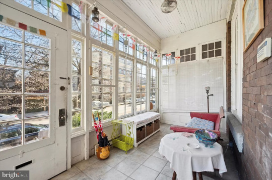
What a cute sunporch. Look at the original closets.
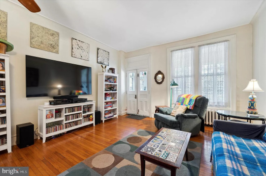
Spacious living room and look at the original double doors.
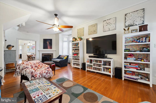
This is very nice, love the fireplace.
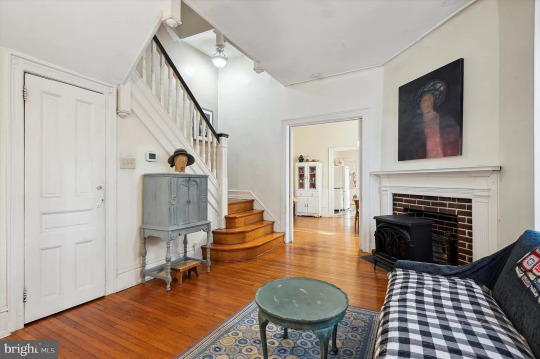
The original stairs are in the living room.
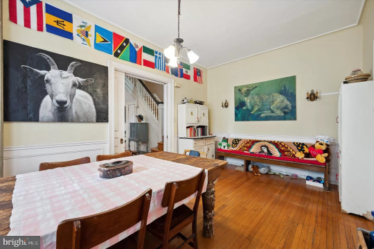
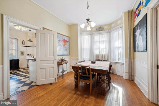
The large dining room has the lovely bay window and double doors open to the kitchen, while pocket doors close off the living room.
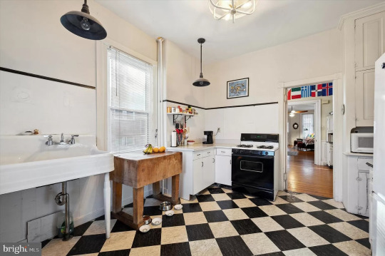
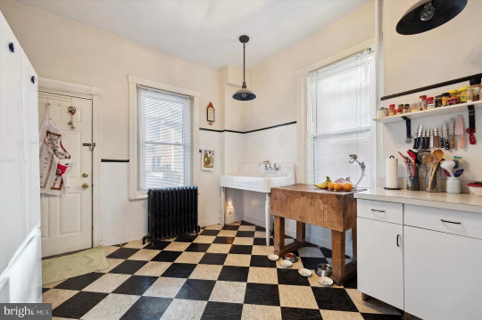
Now, this is a vintage kitchen. It's big, but so cute an cozy. A nice vintage piece of furniture as an island would be great in here.
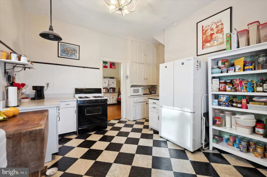
Look at the original cupboard in the corner. They canceled the open house b/c it just went under contract, so I hope that the new owner doesn't come in and demolish this kitchen.
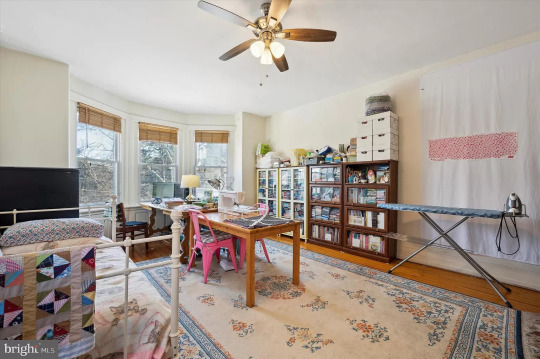
This bedroom is so big, it's a full-sized craft room, too.
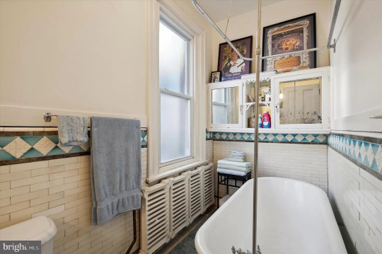
This vintage bath has charm, from the tiles to the tub, radiators, and original mirrored cabinet.
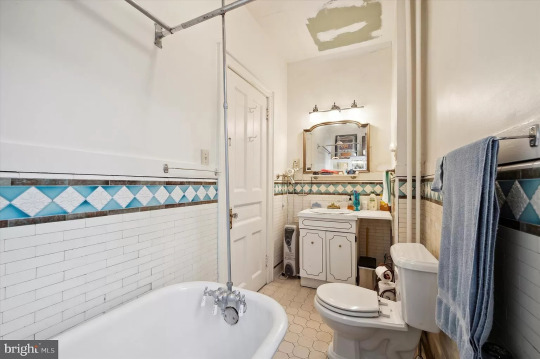
A little disappointed in the sink, but it could be replaced.
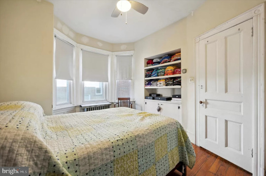
Cute bedroom with a built-in.
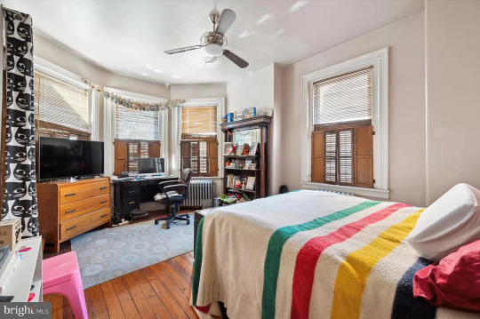
This bedroom is large enough for an office area.
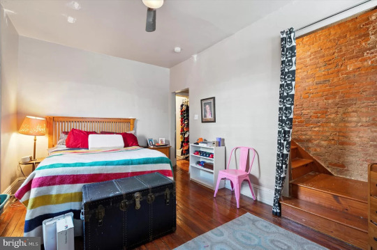
This is neat- original stairs with exposed brick. I wonder if the wall was added to make an extra bedroom. Usually a staircase like this wouldn't be behind a wall.
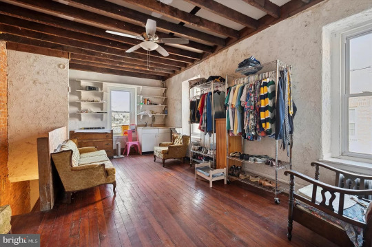

Interesting room up here has potential. Looks like there's a loft, too.

And, then there's another floor.
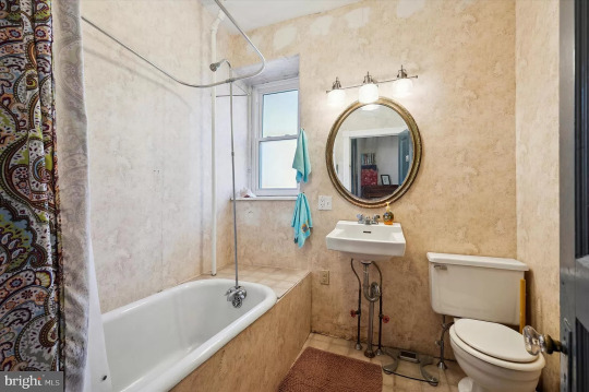
This bath was redone, but I lived in an apt. like this once. That's a claw foot tub- they enclosed it to make it look modern. Get the sledgehammer b/c it's goin' down.
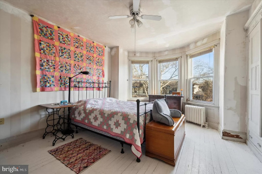
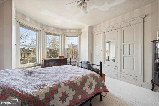
This must be the primary bedroom. Beautiful natural light and look at the closet. It looks like they repaired the ceiling, but why did they spackle over the wallpaper?
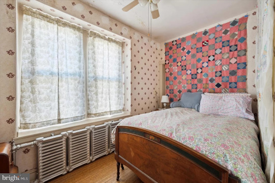
Cute smaller bedroom.
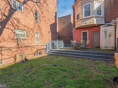
There's a nice deck, plus a yard with potential.
123 notes
·
View notes
Text
9035-3 Korean Floral Wallpaper Roll : Big Size 106 cm x 15.5 m
Looking to spruce up your living space with a touch of nature and color? Look no further than our 9035-3 Big Size Floral Wallpaper Roll! This beautiful wallpaper features a stunning floral design that will add a breath of fresh air to any room. Made in Korea with the highest quality materials, this wallpaper roll measures a generous 106 cm x 15.5 m, ensuring you’ll have plenty to cover your…
0 notes
Text
Elevate Your Space: A Complete Handbook to Selecting Wall Stickers
Wall stickers are now a common innards design trend because they can fluently change a space. They're protean and with little trouble, may add a particular touch to your home or office or produce a sportful atmosphere in a daycare. Accordingly, an applicable selection of wall stickers can determine whether they achieve this thing effectively. This companion provides the crucial effects to consider in opting for wall stickers, why it's salutary as well as some colorful themes and styles ’ recommendations plus applicable images that would inspire you.
Factors to Consider When Choosing Wall Stickers
Several factors need to be considered when choosing wall stickers to make sure they blend well with your space and particular taste.
Size Take into account the available wall space and the asked impact. However, for reciprocal stickers, go for them; if not, you want small ones.
Design What's the overall theme or style of the room? Whatever your choice, nature-inspired motifs, geometric patterns, inspirational quotations, or characters, there’s always a commodity befitting one’s taste.
Color The colors named should blend impeccably with other effects set up in your house. However, colors play a big part in perfecting how beautiful everything looks in general, If you’re going for bright bold tinges or maybe mild dull tones.

The good thing about using wall stickers
Wall Stickers can be used in a variety of ways to epitomize a living space without having to use the traditional makeup or wallpaper that would last forever.
Price most of the time, they're cheaper than conventional wall art or decorations and make it easier for one to change a room’s look without evacuating his fund.
Ease of Use Wall stickers are generally simple to put up and remove without leaving behind any stains or traces when changing your home style constantly or if you're renting.
Cultural Implicit By decorating with wall stickers, you can display your gusto and oneness by way of your particular space at home or office.
Picking out Ideal Wall Stickers for colorful Areas and Conditions
Children’s Apartments Consider investing in some entertaining educational beast-themed designs similar to cartoons which will produce an instigative terrain for babies and toddlers.
Living Apartments Sophisticated botanical designs, motivational quotations, or abstract patterns will help add some fineness to this area while making it feel more yours than anybody differently’s.
Use motivational quotations, minimalist styles, or nature-told showpieces to support productivity and comfort in the plant.
Bedrooms Relaxing natural scenes, ethereal geographies, customized badges.

Recommendation- When opting for the right wall stickers for your room, you have to look at several effects similar to brand character and quality. Like any other product that you buy for your house, office, or kiddies, you want to ensure that it's worth your plutocracy. The most popular brands of wall stickers include Rangoli Furnishings and Roommates about quality, price, etc grounded on my exploration. In case you wish to see them, they're high-quality wall stickers.
Recommendations for Colorful Themes and Styles
Nature- Use tree symbols, flowery motifs, or serene geographies to bring nature outside and produce a calm natural terrain.
Geometric Patterns Use pictorial or dull- multicolored bold lines with angular designs like circles, places, and blocks that will add an over-to-date touch to the whole image creating depth and making it more intriguing visually.
quotations and aphorisms Inspirational quotations, facetious expressions, or substantiated aphorisms can help buck up your day by offering positive dispatches whenever you need them.
Customizable Symbols epitomize the space with symbols that feature family names, important dates, or unique designs made according to one’s solicitations.
In conclusion, wall stickers give a hassle-free way of perfecting any space on a budget. You need to take into consideration some factors similar as size, design, color, and material when choosing so that they allow you
Source:- https://shoprangoli.in/collections/wall-stickers
0 notes
Text
How to Decorate a Small Victorian Bedroom
One of the best things about Victorian bedrooms is that they are so versatile. This is a style that can be done in any color palette and with any type of furniture.
Victorian Bedroom Design Definition
Cream, pink and wood tones define this refined Victorian-designed bedroom. A king bed is located opposite the window seating area. Cream wall-to-wall carpeting adds softness to the room. The main key when buying or renting a house is to pay attention to the design and comfort of the bedroom
A headboard is a simple way to add a Victorian touch to your bedroom. These tall units are great for creating a room aesthetic, allowing you to display antique mirrors and other decorative items.

These beds usually feature carved designs and ornate decorations. They also come in a variety of colors ranging from subtle to bright, and some may include family crests or other unique accents.
Design and Characteristics of Victorian Rooms
Most of these frames require a base, as placing the mattress directly on top of the slats will not work. However, some more modern models can support flat-screen TVs if you mount them using the appropriate brackets. This option is perfect for those who want to combine Victorian style with the modern comfort of watching television in bed.
Victorian bedroom decoration can create a beautiful and romantic space that is luxurious, elegant and timeless. Typical bedroom decor for this style includes a calming color palette, ideally floral wallpaper, and lots of accents.

Choosing the right mirror for your Victorian bedroom is important to keeping the room looking beautiful. The size of your mirror can have a big impact, and its shape can add a unique, eye-catching touch. The color of the frame is also important, as is the placement of the mirror in the room. For example, a mirror hung facing a window illuminates your reflection. It's not ideal for everyday use, so it might not be the best in the bedroom.
Adds a Touch of Romantic Drama
A four-poster bed adds a sense of grandeur and drama to the bedroom. The tall posts on these beds offer a sense of privacy and are often covered with curtains for winter (keeping you warm) or summer (protecting you from pests).
This dark oak four-poster bed features bold carvings, including lions and satyrs, indicating the royal heritage of its past owner. It also features traces of brightly colored paint that will produce a rich and dramatic effect.

You don't need a large space to accommodate a four-poster bed. This sleek wood version looks beautiful in a small room and draws color from a natural fiber rug.
Iron-framed beds are an iconic choice for your Victorian bedroom. Unlike modern metal beds, Victorian frames were made of wrought iron, a material known for its durability and timeless elegance. Inspiration for getting a Victorian bedroom can be through property sales sites property.thegardengranny.com.
1 note
·
View note
Text
Beautiful Powder Rooms Can Make a Big Impact on Your Decor
Whether you’re looking for an updated look or just some new ideas, a beautiful powder room can make a big impact on your home’s decor. From a chic, Moroccan-inspired mosaic design to a designer’s Guild wallpaper, there are many options to help you make a design statement.
Designer’s Guild wallpaper
Whether you’re redecorating a small powder room, or adding an extra bathroom, wallpaper can make the space feel more polished and complete. A bold pattern wallpaper can transform a drab room into a focal point without overwhelming the space. For ideas and swatches, check out Designers Guild Wallpaper. Whether you’re looking for a statement-making pattern or soft neutrals, you’ll find just what you’re looking for.
A restful kid’s bedroom features a blue and white pom pom pillow, a white bed and bedding, and a window seat upholstered in a blue velvet cushion. A large brass-rimmed mirror on the wall adds dimension and magnifies natural light. Pink accent pillows add a playful touch.
A contemporary powder room with a white marble countertop is complemented with a contemporary wallpaper that echoes the color scheme. A framed print above the toilet reminds you to include art in all areas of your home.
Moroccan-inspired mosaic design
Using a Moroccan-inspired mosaic design in your powder room can make a major impact on your bathroom design. Whether you want to create a contemporary look, or you’re looking to add a splash of glitz, a mosaic design is an excellent choice.
The most obvious way to use a mosaic design is to use it on the floor. You can also stencil it on a wall. Whether you use it on the floor or on the wall, a Moroccan-inspired mosaic design can make a splash in your powder room.
A good way to use a Moroccan-inspired mosaic design in your home is to create a monochromatic look. This allows you to take advantage of natural light and fresh vibes. Also, it gives you more surface area to style your Moroccan feature.
Embrace bold hues
Embrace bold hues in beautiful powder rooms to create a statement worthy of a high-end magazine cover. From bold wallpaper to funky bathroom mirrors, these ideas will make your space a stylish showpiece.
The bathroom mirror is an important component of your bathroom. A mirror with a convex glass is a fun way to add some sparkle to your powder room. Choosing a metallic finish for your mirror is a smart way to coordinate with your fixtures.
Using a unique tile or backsplash can create a focal point and help to define the room’s style. You can even incorporate some colorful stripes to add a sense of spaciousness and a playful touch.
Using a convex mirror elongates the space and adds a funky element. You can also mount lights in your mirror to create an elegant space.
Feature built-in bookshelves
Adding built-in bookshelves to your powder room can help maximize your space while adding style and functionality. You can also use this smart storage solution to display your favorite decor or collectibles.
Choosing the right size and style of built-in bookcase is important. For example, it is better to have a small and narrow unit than a larger and wider one. Also, it is a good idea to keep in mind the ventilation of your room.
A built-in bookcase can be installed in any room in the house. They can be custom-made to fit your space and requirements. They can be used to display your favorite knick-knacks, art or even your library collection. They are also a good way to maximize your storage space while keeping your desk free of clutter.
Make a design statement
Creating a design statement in your powder room can be a great way to show off your style. It is a perfect opportunity to experiment with pattern and bold design elements.
A good place to start is with a bold wallpaper. Walls with patterns can create a room that feels bigger. It also helps to have a neutral palette to allow the interesting materials to stand out.
You can also use textured wall panels in your powder room. These can be a great way to replace art and make your room feel more cozy.
Another way to create a design statement is by choosing a bold tile. A graphic tile backsplash can clash with a pattern tile floor, but can be a great way to add a unique element to your powder room.
.video-container {position: relative;padding-bottom: 56.25%;padding-top: 1px; height: 0; overflow: hidden;} .video-container iframe, .video-container object, .video-container embed {position: absolute;top: 0;LEFT: 0;width: 100%;height: 100%;}
youtube
Whether planning a bathroom renovation or simply updating your existing space, Vancouver Kitchen Renovation can help you create a bathroom that fits your style and budget. With years of experience working with homeowners across Vancouver, BC, we know how to transform bathrooms into spaces that fit your lifestyle. Whether you’re looking for a modern look or something more traditional, we can help you achieve the look you want. As a locally owned and operated company, we pride ourselves on providing quality products and exceptional customer service. When you choose VK Renovation, you can rest assured knowing that you’re choosing a company that cares about your satisfaction.
We understand that to be successful is to stay ahead of the curve. That means staying current with the latest technology and design trends. We always want to improve our products or services without breaking the bank. That’s why we stay connected to the latest technologies of NKBA, National Kitchen and Bath Association. In addition, at Vancouver Kitchen renovation, our primary focus is providing sustainable bathroom design and renovation packages, and we believe in sustainable living. Sustainable living is a way of life in harmony with nature. It is a lifestyle which focuses on the preservation of our environment. Sustainable living is a philosophy emphasizing respect for the environment and concern for its well-being. This means we should take care of the planet and treat it as if it were our home. We should try to preserve what we have and protect it from destruction. If we do this, we will enjoy the benefits of the earth’s resources for many generations. Whether you’re planning a major remodel or adding finishing touches to your current bathroom, we’d love to discuss your project. Book your showroom consultation online.
Main Areas of Service in British Columbia:
Vancouver
North Vancouver
West Vancouver
Burnaby
Coquitlam
Squamish
Whistler
Frequently Asked Questions
How can my bathroom feel tranquil?
A bathroom that is well-designed and functional can be used as a space for reflection and relaxation. After an exhausting day of work, this is where we relax. It’s where we go to relax after a long day of activity.
Answer is simple: Bathrooms are places to relax. Showering is a way to wash away stress. We wash our hands and brush our teeth.
There are many ways to make a bathroom quiet and peaceful while still providing all the amenities.
White walls, for instance, make a room feel brighter and cleaner. White walls also reflect light, making the rooms seem larger.
A large mirror allows you to see your reflection without moving.
Consider adding candles to your bathroom to create a tranquil environment. Candles are a great way to add warmth and security. Scented candles can create a sense of calm and security.
The bathroom can be made more peaceful and serene by adding plants. Plants are known to reduce stress levels and increase focus.
Lighting is another way of setting the mood. A warm atmosphere can be created by lighting. Warm lights such as those from candlelight can create a peaceful environment.
Remember to take some relaxation time next time that you go to the restroom. This is where we can be totally free of all outside influences.
How can you make the bathroom more sustainable?
There are several options to make your bathroom more energy-efficient. Installing low-flow fixtures like toilets or showerheads is one way. This will conserve water. You can also use green cleaning products that are more friendly to the environment. Finally, you can try to use recycled materials in your bathrooms, such as recycled glass or metal. Making small changes can make your bathroom more eco-friendly.
Should floor tiles be darker that walls?
Not necessarily. The tile should be the same for floor and wall. You can choose to use two tiles if you wish. A modern bathroom should have fewer tiles.
Statistics
This article will reveal more about AntiBac surfaces and how Villeroy and Boch products have 99.9% fewer bacteria. (superbath.co.uk)
WaterSense-labeled bathroom sink faucets use a maximum of 1.5 gallons per minute, reducing water use by 30 percent or more from the standard flow of 2.2 gallons per minute – without sacrificing performance. (elemental.green)
NKBA estimates that broken down, most of this cost comes from fixtures and plumbing (about 29 percent), followed by counters and surfaces (21 percent), labour (20 percent), and cabinetry and hardware (16 percent). (remodelista.com)
2023 bathroom design trends: Floating vanities were favoured by 71% of those surveyed. (https://nkba.org)
2023 bathroom design trends: Heated floors were favoured by a substantial 75% of those who responded to the survey.(https://nkba.org)
According to the EPA, a conventional toilet uses 1.6 gallons per flush, but that old pink one could use between 3.5 to 7 gallons per flush. (elemental.green)
Keep in mind: they advise that, all told, your bathroom project should cost no more than 5 to 10 percent of your home’s value. (remodelista.com)
The average midrange bathroom remodels costs $27,164, according to the latest Remodeling Cost versus Value report, and it’s projected that you will recoup 58.9% of that cost when reselling your home. (architecturaldigest.com)
2023 bathroom design trends: Windows above tubs were favoured by 51% of those surveyed. Skylights were selected by 37% of those surveyed. (https://nkba.org)
If possible, allow a 15 to 20% contingency fund so you’re prepared for the unexpected. (loveproperty.com)
I can’t tell you the number of times I’ve had someone call and say they have an existing old tub (which, 99% of the time, is 60” wide once they’re pulled out) and want to convert the bathtub to a shower. (blog.innovatebuildingsolutions.com)
With this technology, whether you take a 5-minute or a 50-minute shower, you’ll use the same amount of water, reducing your use up to 90 percent! (elemental.green)
External Links
homeadvisor.com
Learn how much it will cost to remodel a bathroom
Where does your money go for a bathroom remodel? | HomeAdvisor
houzz.com
2020 U.S. Houzz Bathroom Trends Study
Houzz
How To
How to design a beautiful Bathroom Yourself
Choose a Color scheme that suits your Home Before choosing any colour scheme, think about how it will fit with the rest of your house. For example, if you live in an older home, you may want to avoid bright colours such as red, orange, yellow, and green. Opt for more subtle shades, such as blue, gray or white, instead.
You have more options when it comes to bathroom colors if you live in a newly constructed home. Brighter colors are possible, but they should be used sparingly. A brightly-coloured towel rack or accent wall might be enough to give your space some personality.
Make sure there’s plenty of storage space
It is important to ensure there is enough storage space in your bathroom. You should have enough space for hand soap, towels, makeup brushes, and any other items you keep in your bathroom.
If space is tight, you might consider floating shelves or medicine cabinets. These will add storage space to your home without taking up much space.
Add mirrors to your home
Mirrors make a great addition for any bathroom. Mirrors let you view yourself in your powder room. Mirrors come with a variety of sizes and shapes. Some mirrors have a rectangular design, while others are more round. You can even find mirrors that are shaped like animals or flowers.
Add proper Lighting
Lighting is crucial and requires attention. Lighting your bathroom is a complex task that requires careful consideration.
The first thing you need to think about is what type of light bulbs you want to use. There are many options: LED, halogen, or fluorescent.
Next, choose where you want your light fixtures to be placed. They can be mounted on the ceiling or the walls. Your bathroom must have sufficient windows to let in natural lighting. A skylight may be an option if you don’t have enough windows.
Your preference will dictate the type of lighting you choose. Make sure that you only use bathroom light fixtures. This will ensure they can withstand the moisture and humidity of this space.
Select The Right Flooring
The flooring you choose should be slip-resistant and easy to clean. There are many options for bathroom flooring: luxury vinyl, porcelain tiles and natural stone.
Avoid dark-coloured flooring in small bathrooms. This will make the space appear smaller and more cramped. Instead, opt for lighter colours such as white, cream, or beige.
Take Care in Choosing Your Layout
The layout of your bathroom is as important than the choice of fixtures and colours. You should consider how you will be using the space when designing your layout.
If you have a small bath, it may be a good idea to not install a bathtub. This will make it easier to move around.
You may want to add a double sink in a larger bathroom. This will give you more countertop space and make it easier so that two people can get ready at the same time.
You can begin planning your layout once you have a clear idea of how you would use the space. You can measure your room using a tape measuring instrument. Then, sketch out a few different layout options on graph paper.
After you have tried a few layouts out, choose the one that best suits your space.
Do not forget about ventilation
To stop mould and mildew growing in bathrooms, they need adequate ventilation. This is particularly important if you live near a humid climate.
Before installing the fan, make sure you read all instructions. Make sure the fan vents well to the outside of your house.
Use only the best materials
When remodelling your bathroom, choose quality materials. The durability and resistance to damage of high-quality materials is better. These materials can be more costly upfront but will end up saving you money in long-term.
Ask for help from professionals
Remodeling your bathroom isn’t difficult. Hire professionals to do the job right. The different aspects that go into building projects are handled by professional contractors. They can install heating/cooling, plumbing, and electrical wiring. You will save time and avoid headaches by hiring professionals. Plus, they know precisely how to complete each project step correctly.
Enjoy Your New bathroom
After all the planning and hard work, it’s time to enjoy your new bathroom. You can finish the bathroom with some finishing touches like scented candles, fluffy towels and a plant. These little touches will make your bathroom feel like home.
Now that you know how to remodel your bathroom, it’s time to start. These are some tips to help you design the bathroom of your dreams.
The post Beautiful Powder Rooms Can Make a Big Impact on Your Decor first appeared on Vancouver Kitchen Renovation.
source https://vancouverkitchenrenovation.com/bathrooms/beautiful-powder-rooms-can-make-a-big-impact-on-your-decor/?utm_source=rss&utm_medium=rss&utm_campaign=beautiful-powder-rooms-can-make-a-big-impact-on-your-decor
0 notes
Text
The Best Features of Arihant Advika: Amenities That Make Life Easier
Arihant Advika is a luxurious residential project located in Vashi, one of the most coveted suburbs of Mumbai. The project offers a wide range of flats for sale in Vashi, including 1 BHK in Vashi and 2 BHK in Vashi. One of the biggest draws of Arihant Advika is its impressive range of amenities that are designed to make life easier for its residents.
One of the standout features of Arihant Advika is the 11 feet height (floor to floor) of each apartment. This ensures that the apartments are spacious, well-ventilated, and offer ample natural light. The high ceilings also create an illusion of more space, making the apartments look even bigger than they already are.
Another feature of Arihant Advika that sets it apart from other residential projects is the big bedroom sizes. The bedrooms in each apartment are spacious and offer enough space for a king-sized bed, wardrobe, and other furniture. This ensures that residents have ample space to move around and enjoy a comfortable stay.
The living room and passage of each flats for sale in Vashi at Arihant Advika are adorned with Italian marble. This adds a touch of elegance and sophistication to the interiors of the apartment. The Italian marble not only looks beautiful but is also easy to maintain and lasts for a long time.
Arihant Advika also offers big-sized windows that provide ample natural light and ventilation. The windows are designed to offer stunning views of the surrounding greenery, making it a perfect escape from the hustle and bustle of the city. The elegant bath fittings in each apartment add to the luxurious feel of the project and provide residents with a spa-like experience.
The project also boasts of high-grade Geberit plumbing pipes and a Bus-Duct system. This ensures that residents have uninterrupted water supply and electricity, respectively. The plumbing pipes are made of high-quality materials that are durable and long-lasting. The Bus-Duct system ensures that residents have access to uninterrupted power supply, making their lives easier and more comfortable.
Each apartment in Arihant Advika comes with wallpaper on all walls. This adds a touch of elegance and sophistication to the interiors of the apartment. The wallpaper is available in a range of designs, colors, and patterns, ensuring that residents can choose the one that best suits their taste and style. The project also features extra lifts in each tower, ensuring that residents never have to wait long for an elevator. This is particularly useful during peak hours when elevators tend to get crowded.
Arihant Advika is a luxurious residential project that offers a wide range of amenities that make life easier for its residents. The project offers flats for sale in Vashi, including 1 BHK in Vashi and 2 BHK in Vashi. Some of the standout features of the project include the 11 feet height of each apartment, big bedroom sizes, Italian marble in the living room and passage, big-sized windows and elegant bath fittings, high-grade Geberit plumbing pipes and Bus-Duct system, wallpaper on all walls, and extra lifts in each tower. If you are looking for a luxurious and comfortable living experience, Arihant Advika is the perfect choice for you.
Note : This article is already posted on medium.com
Ref URL : https://medium.com/@aryansharma.02mumbai/the-best-features-of-arihant-advika-amenities-that-make-life-easier-fb494774009e
0 notes
Text
Milky Way, a meteor, the moon and erupting volcano caught in one shot
Milky Way, a meteor, the moon and erupting volcano caught in one shot
Photographer Mike Mezeul managed to score a real one-shot wonder - by capturing lava, the Milky Way, the moon and a meteor all in the same image while on a trip to Hawaii.

Volcano 3D Model

Molten Chocolate Lava Cakes
Molten chocolate lava cakes are rich and fudgy with a classic gooey chocolate center that flows out like lava. So simple and easy to make.

lava rocks Preview

Inside Iceland's active volcano ©Hermann Helguson

Chocolate Molten Lava Cakes
This easy molten lava cake recipe video is about to melt your tastebuds with its chocolatey, gooey centre. A perfect after dinner dessert.


These Photographs Of Volcanic Eruptions And Textures Are Mind Blowing
Long exposure photography is a tough but very rewarding genre where one can capture the movements of elements around. There are times when photographers get to any extreme to capture the beauty of the things around them, in the sense that, they do not even worry about the risks involved. This week, we have an internationally recognised and leading volcano and nature photographer G. Brad Lewis, who is also called the Volcano-man and has shot some award winning and incredible photos of volcanoes. Volcanic Photography can be a very dangerous job, but anyone ready to face these dangers are sure

Chocolate Lava Cake - Tornadough Alli
If you love easy and simple desserts then this Chocolate Lava Cake has to be top on your list. With only 5 ingredients this can be made from start to finish in under 30 minutes!

Mac and Cheese Lava Cake
Indulge in these creamy bite-size Mac and cheese cakes for any occasion. This tasty recipe revisits the family-favourite classic and it really won't disappoint you.

Coal Texture Shrub Wallpaper Background
More than 3 million PNG and graphics resource at Pngtree. Find the best inspiration you need for your project.

The Best Chocolate Lava Cake Ever

Magma H5 Background
More than 3 million PNG and graphics resource at Pngtree. Find the best inspiration you need for your project.

Advertisement Out of this world! Photographer captures the Milky Way, a meteor, the moon and an erupting volcano all in the same shot Mike Mezeul, from Allen, Texas, traveled to Hawaii's Big Island to take these magnificent photographs On Kilauea volcano he captured one shot combining the lava, the Moon, the Milky Way and a meteor 'I was in shock...I knew I couldn't beat that image, so I packed it up and headed back,' said the 32-year-old. By Chris Summers For MailonlinePublished: 16:09 GMT, 10 October 2016 | Updated: 18:20 GMT, 10 October 2016 e-mail 226 shares15ViewcommentsAdvertisementPhotographer Mike Mezeul managed to score a real one-shot wonder - by capturing lava, the Milky Way, the Moon and a meteor all in the same image.The 32-year-old, from Allen, Texas, was in Volcanoes National Park on the Big Island of Hawaii when he seized the chance to capture the combination of Mother Nature's beauty.The fiery red of the lava in the foreground is in deep contrast to the purple and blue hues of the galaxy beyond and the meteor can be seen as a white line.This astonishing photograph would be pretty incredible if it was just of the lava but Mike Mezeul was lucky and skilful enough to also capture the Moon (on the right hand side), the Milky Way (in the center) and the meteor (the thin white vertical streak on the left) Mike Mezeul used a time lapse device to take this photograph of himself standing near an active lava flow on the Pumala Pali peak in Hawaii'ss Volcanoes National ParkHe said: 'I was literally in shock. It was my third frame to shoot after the sun had set, and after I saw the meteor, I knew I couldn't beat that image, so I packed it up and headed back.'Fortunately by that time he had already taken dozens of other amazing pictures of lava as it poured into the sea, creating billows of steam like nature's very own foundry. Mr Mezeul explained: 'There were some times while shooting that I only had a few seconds to get the shot before having to move because of risking getting burned.' This incredible shot shows Mike Mezeul getting up close to the burning lava as it pours down the hillside, cooling and turning into stone in front of his eyesThis epic picture looks like a vision of the gates of Hell as the molten lava pours down towards the seaThe molten lava pours straight into the Pacific Ocean off the coast of Hawaii's Big IslandHubble, bubble, toil and trouble: The lava splashes into the sea, creating clouds of steamKilauea (pictured) is one of the five volcanoes on Hawaii's Big Island and is estimated to be around 500,000 years oldMike Mezeul said: 'The hike out to the lava was pretty strenuous as well, all together it was nearly a 13 mile hike round trip through some of the most extreme landscape I've ever been in'Kilauea was dormant between 1952 and 1982 but since 1983 it has been continually erupting and spewing molten lava out of a vent on the eastern side of the volcanoThe U.S. Geological Survey measured Hawaiian lava as 1,100 Degrees CelsiusThe Hawaiian archipelago was created millions of years ago and the north western islands are the least volcanically active while Kilauea (pictured) in the far south east is the most active areaMike Mezeul said: 'Once I found the lava surface flows, it was so amazing to see something that had traveled so far from the centre of our Earth to that exact spot where I was standing. This was a first for me shooting lava, and it certainly won't be the last' Dreadful moment car 'runs over two people after mounting pavement' Armed Proud Boys clash with LGBTQ supporters at Ohio drag event Suella Braverman: I will not be hectored by out-of-touch lefties Eleanor Williams in Blackpool purchasing Pot Noodle and milk Tommy Robinson joins 'Justice for Ellie' protest in 2020 Innocent men targeted by rape fantasist reveal their pain EXC: The reality of the Bakhmut trenches Pet zebra rips Ohio man's arm off leaving him seriously injured Cumbria Police: Never seen anything of this magnitude and impact Moment drunk murderer returns to crime scene and gloats to police Glory to Ukraine: Brave soldiers release footage of intense fighting BUSTED: Police divers seize drug traffickers' mini submarine View allThe comments below have not been moderated. View allThe views expressed in the contents above are those of our users and do not necessarily reflect the views of MailOnline.We are no longer accepting comments on this article.
1 note
·
View note
Text
Beautiful Nature Wallpaper Big Size #17 with Autumn Forest Picture in 4K
Beautiful Nature Wallpaper Big Size #17 with Autumn Forest Picture in 4K
Autumn forest pictures are popular to create a nature wallpaper. Such as this one, an awesome high resolution fall picture by Aleksei Malygin with high quality result. Basically, the original photo of this wallpaper was in 3750×2500 pixels. But it was adjusted into 4K resolution with 3840×2160 pixels. Aleksei Malygin used a camera of Canon EOS 6D with several settings such as: f/10 1/125 17mm…
View On WordPress
#4K Nature Wallpaper#4K Wallpapers#Autumn Forest Picture in 4K#Autumn Wallpaper#beautiful nature wallpaper#beautiful nature wallpaper big size#High resolution fall pictures
1 note
·
View note